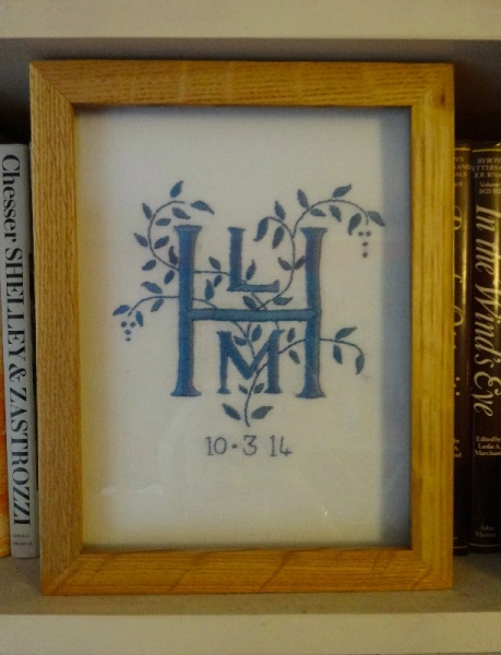
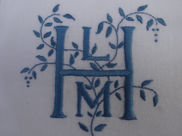
Earlier this week I had a sudden desire to embroider with blue thread. An old friend had sent me a skein of woad-dyed embroidery thread bought in France earlier this summer and perhaps not wanting to loose something so special before I could use it (a frequent occurrence) I thought it would be perfect for a small monogram for a little boy christened only a week ago. It was relaxing to do something very simple with just 3 initials and a bit of foliage.
There’s something very satisfying about blue and white as a colour combination, specially in connection with kitchens and crockery. At the back of my mind I have a feeling blue may be associated with keeping flies at bay but having briefly researched this I’ve discovered that with tsetse flies the opposite is true – tsetse flies adore electric blue and cloths of this colour are actually used to trap them. Thank goodness that as yet we have no tsetse flies in England.
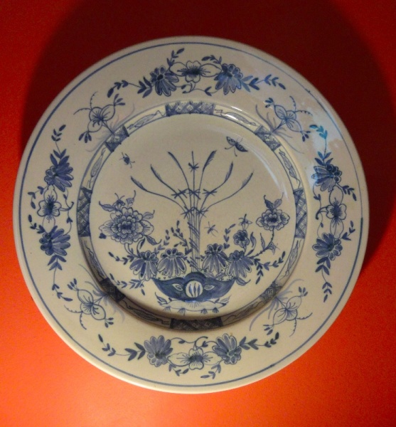
The woad blue I was sewing with is very like the blue seen in Delft Pottery. I don’t have any of that but over the years I have collected (and in part lost) pottery by Isis Ceramics which is made in similar manner, style and spirit to English Delft of the C17th & C18th. The pottery was set up by American Deborah Sears and it began life in an old Toffee Factory in Oxford’s Western Road, a stone’s throw from Folly Bridge under which flows the Isis (as the Thames is known in Oxford).
This tiny factory used to host great sales (the new factory almost certainly does too) and those just before Christmas each year were a good way of buying the best sort of Christmas presents. It was usually raining and muddy but Deborah would be there smiling in the showroom above the pottery with plates, bowls, cups and saucers teetering in piles amidst homemade mince pies and mulled wine. Her Christmas tree was always decorated with painted pottery shards (plants, animals, funny little figures and random squiggles) and pottery bells, etc. I remember being invited to her house one time where her real Delft nuzzled happily alongside her own Isis Delft and in candlelight there was nothing to divide the two.
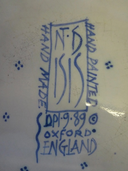
Isis Ceramics: maker’s mark on the back of a 15″/38 cm circular platter. I think decorated by Deborah Sears (D & conjoined S at top right)
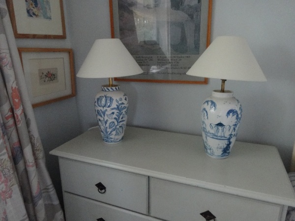
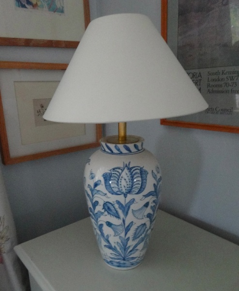
In 2000 the pottery moved to Horton-cum-Studley, a village to the east of the city to a site known as The New Toffee Factory (and I wouldn’t be surprised if Deborah made at least one batch of toffee there to validate the name). This summer, 14 years later, I made my first visit to the new site to pick up a lamp ordered as a present for me by daughter No 1 and son-in-law. I have long had one of Isis Ceramic’s wig stand lamp bases (and have long wanted another) and now I have its pair (same shape, different painted design). Matching lamps on bedside chests of drawers sustain a delight in symmetry that I try not to indulge in too often – the same design would have been just too much.
Delft pottery is the generic term for tin glazed earthenware. Isis Ceramics designs are hand painted on ceramic pieces that have been biscuit fired and then dipped in opaque tin glaze in the traditional manner. Formerly lead was a component in the glaze but now that its use is prohibited the end colour is slightly different from that of original English Delft – an unforeseen consequence of not using lead is that the pieces don’t chip so easily and it’s clear from looking at antique English Delft how fragile they are as few pieces survive intact. Deborah has also embraced other colours – I think her manganese plum is particularly successful.
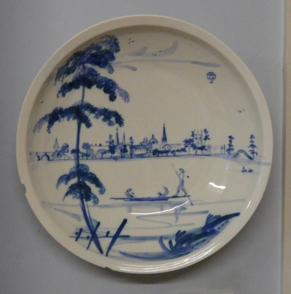
I’ve included photographs of just a few of my collection. I have another round platter (15″/38cm diameter) with a cockerel while that one above has flowers but I think these are of both design and shape that Deborah no longer produces. The bowl with the view of Oxford from the river (with an orientalised punt?) is also possibly bit of a rarity and reminds me of the time I lived on the river at Folly Bridge and took the same punt journey almost every evening. One wig stand lamp base is in English Garden (little architectural follies in a leafy landscape) while my latest lamp base is in Tulip, a design inspired by C17th needlework, so you can see why I like that. Both the woad dyed cotton and the underglaze blue on the pottery exemplify a colour lesson I remember being surprised at when I first began to embroider – what looks like a slightly dirty colour often sings much better on white that something that in itself looks prettier. (Let the tsetse fly go for the brighter colours – but perhaps not always.)
10 Comments
Love the monogram what a lovely idea for a christening!
I always try to make monograms or decorated initials for the weddings and christenings my husband takes (though I’m always behind). It’s very heart warming that people appreciate the fact that they’re made by hand and I have had some lovely letters back saying this.
I always come away from reading one of your posts feeling inspired, and educated!
And I’m always greatly encouraged by your kind comments, Penny!
Hi Mary. The monogram is very attractive. There is a little room in the Ashmoleum (the old bit) which houses a small collection of Englist Delft. Have you seen it. I think it is the collection of one gentleman. I always visit it when at the Ashmoleum. The room is a bit shabby, but it appeals to me. Thanks for a lovely post. Bx
Yes, I know the room,and now that you’ve reminded me I’m very eager to go back there with camera and sketch pad. Thanks for jogging my memory.
I too love blue and white and was lucky enough to inherit my mother in law’s small collection of blue and white china plates. They remind me of the 16th century Flemish paintings of those wonderful peaceful orderly interiors.
I am still reading your archives and indeed getting “inspired and educated” with every click.
What lovely things to have inherited.
It’s nice to know my old posts are being enjoyed – thanks for telling me.
I can only echo one of the comments above – I too am inspired by reading your posts – the blue monogram is just lovely. I have a fledgling collection of blue and white which is threatening to spill out from the dresser to the surrounding walls… impossible to confine it!
It’s funny how blue and white is such a satisfying combination on crockery and fabric.
One Trackback
[…] only worked because so much of the red lies behind about 15 ft of bookshelves! Delft plates from Isis Pottery in Oxford show my love of blue and white pottery has remained […]