The most exciting artwork of the last year – nay decade, in fact possibly of the new millennium – has to be The Great Tapestry of Scotland. I first saw it on Karen Howlett’s Cornflower blog where she showed us work in progress on the section she was helping to embroider and immediately I was hooked. The design is splendidly idiosyncratic yet clear in its story telling and awash with humour. (For example, Panel 68 – see below -shows James Watt, in profile with his steam engine superimposed on his head echoing the idea he had for it, while Panel 74 – see 3rd photo below shows James Hutton, founder of the science of geology wearing a hat that at first glance could be feathers but upon closer inspection is revealed to be an ancient rock formation.)
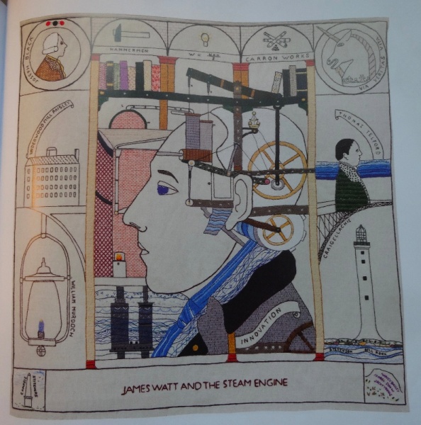
The Great Tapestry of Scotland by Andrew Moffat (Birlinn, 2013): Panel 68: James Watt and the Steam Engine
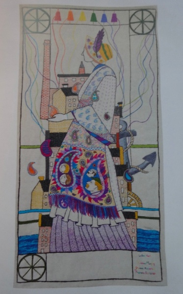
The drawing is strong and clear with often spare but pertinent use of colour (see Panel 107 directly below: Mill Working where a brightly coloured paisley shawl suggests another parallel story with heads of workers and mill owners as the decorative motifs where once there would have been flowers and leaves.)
Each panel is full of quirky detail and thought provoking juxtaposition which is aided and magnified by the little windows framing the main panel (reminiscent of the predellas of Renaissance altar pieces or the borders of the Bayeux Tapestry). A terrific story brilliantly realised – and I say this as someone with a good deal of Welsh and no Scottish blood coursing in my arteries (though, let’s be honest, we British are the ultimate mongrels and there’s probably some Scottish somewhere in most of us.)
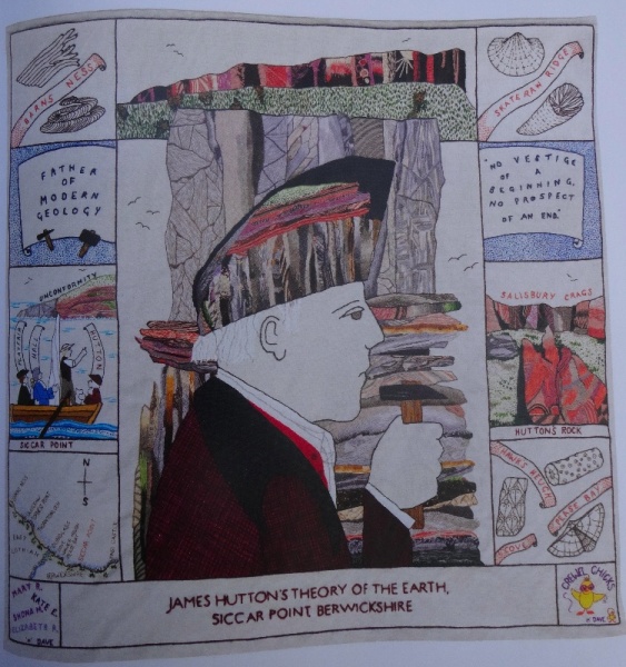
The Great Tapestry of Scotland: Alistair Moffat (Birlinn, 2013) Plate 74 James Hutton’s Theory of the Earth
The project was initiated by Alexander McCall Smith who found himself one of many who were mesmerised by the newly finished Prestonpans Tapestry, an embroidered record of the battle of 1745. Fired by the giant idea of a Tapestry of Scotland McCall Smith ignited the interest of Andrew Crummy the artist of the Prestonpans Tapestry, Alistair Moffat a story teller and wordsmith and, at the sharp pointy end so to speak, Dorie Wilkie, Head Stitcher on the Prestonpans Tapestry, who co-ordinated the more than 1,000 volunteer embroiderers and advised on the stitching. The resultant 160 individual panels is a tour de force which succinctly tells Scotland’s history from its earliest land formations to the (fairly) recent present. One day I hope to see the tapestry itself but having been given the book for my birthday I have been able to study the work at leisure, be informed by its story and most of all inspired by the artist’s design and the stitchers’ interpretative handwork. Brilliant.
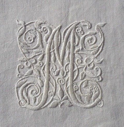
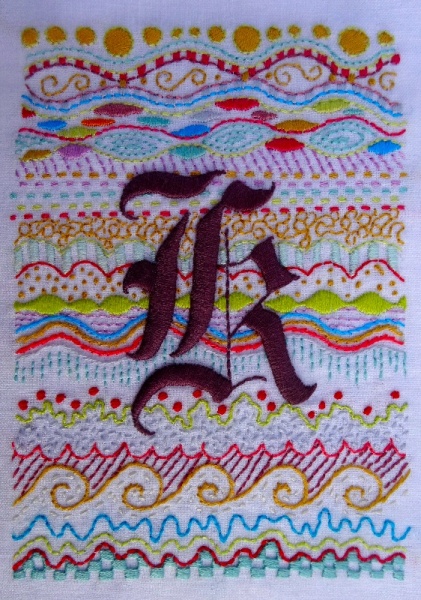
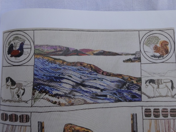
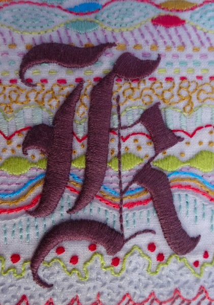
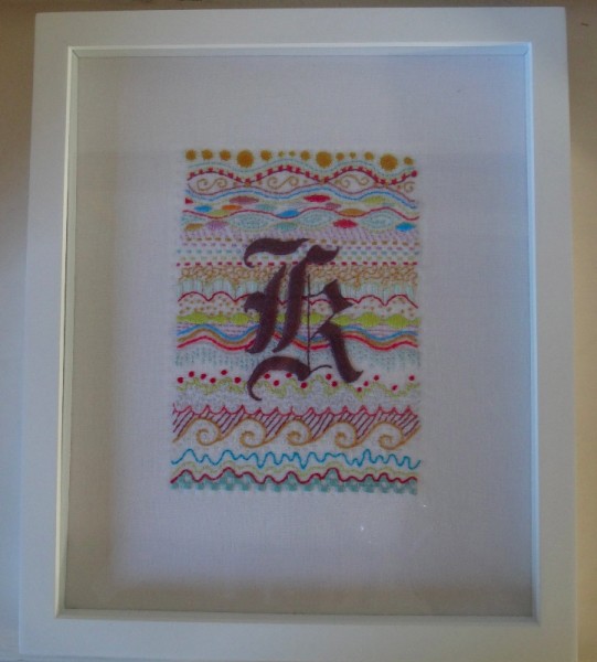
I think the Great Tapestry has taken up permanent lodging in part of my brain and from there makes regular sorties swirling round and washing through other bits of creative cortex. This is reflected in my latest embroidered initial which is more colourful in a Scottishy greeny-gold and purply-red way than what I usually do – and when I came to think about it later – ever so slightly more geological than those I’d done before. (Memo to family: I became very keen on geology at school and somehow managed to persuade whoever needed persuading to let me do an ‘O’ Level in geology in my first year sixth. A kind teacher gave me one lunch hour of her time a week and the rest I did alone and ended up with a grade 2 which I was rather pleased with but which I had almost forgotten about.) And, come to think of it, both samplers and diagrams of sedimentary bedding plains are very similar with their strong emphasis on horizontal banding.
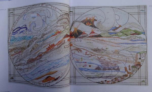
The Great Tapestry of Scotland by Alistair Moffat (pub. Birlinn): panels 3a & 3b showing the formation of Scotland
Gloriously, just as I was setting out to compile this blog, Serendipity, life’s most wonderful wild cannon, delivered the utterly splendid news ( Tuesday’s Times newspaper 16 December 2014) that although the Great Wall of China may not be visible from outer space, rather romantically and somewhat surprisingly the purple heather and the deep green moss of Scotland’s Highlands is! So remarkably beautiful is this green and purple land that last year Commander Chris Hadfield floating 270 miles above the Earth found himself falling heavily in love with that most ancient bit of the British Isles.
Commander Hadfield eulogises:
“Scotland from space, you can see the ancient nature of the rock. The geology really dominates the long striations of the lochs cutting across, especially up towards Inverness. The depth and angularity is very vivid…You can also see the heather and the colour of it. You can see the natural colours of the green and the perpetual moss growth that shows up from space.” The land, he says, exudes an ancient feeling which can be sensed from orbit.
Commander Hadfield is a Canadian with ancestors rooted in the Scottish Borders but it seems it took a trip to outer space for the natural beauty of Scotland to deliver him a coup de foudre for the country itself . This passionate endorsement of a bit of ancient rock is rather wonderful and truly remarkable in that it was not the lights of the manmade M25 which moved our astronaut observer but the glorious carpet of rather a lot of tough heather and a good covering of stubborn moss. For more about Commander Hadfield see dovegreyreader’s blog entitled ”
“There is no problem so bad that you can’t make it worse…’ ~ @Cmdr_Hadfield
here.
This initial is made for a Scotswoman. I find many letter Ks quite unsatisfactory to embroider – where the arms of the letter meet the upright is a bit of a problem (attempted here in whitework). I love this Gothic K for its mixture of thick chunky lines and fine spindly ones and feel it evokes time which the sedimentary sewing behind it does in a different way.
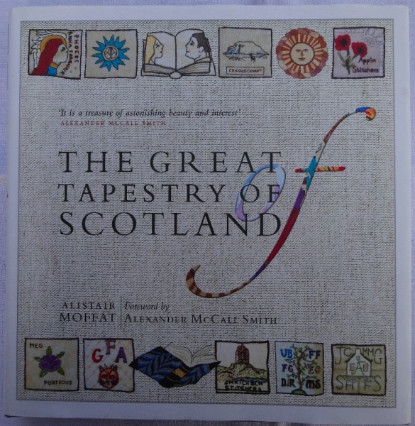
Footnote: The elephant in the room is of course the use of the word ‘tapestry’ for what I’m sure we all know is embroidery. I begin to feel the battle over the use of this word is now well and truly lost and that the word has been expanded by repeated outings to embrace what purists among us might not want it to embrace (not least on all literature associated with this great new piece of Scottish embroidery – see the book cover above). But English is a living, constantly adapting language, and for this reason I bow to the authority of conventional usage.
8 Comments
Love your embroidery initial! I also love the Great Tapestry of Scotland – I too have given up trying to explain that it is an embroidery! I would love to see it in person one day; I have the book and I stitched the tipsy thistle panel from it, it was so much fun to stitch, I made it into a bag.
I saw your tipsy thistle – the draftsmanship is so clever and yet brilliantly allows for personal innovation, it must have been fun to do. I was told that The Tapestry might tour England so let’s hope it comes somewhere near us.
I love your “sedimentary background” – that’s a wonderfully whimsical idea!
Similarly, every time I go past Keble College, Oxford, I find myself thinking ‘knitting as architecture”.
This is life-enhancing celebratory art that says so much more with thread and textiles than words and pictures on paper ever could although I’m unable to say quite why this should be. Thank you so much for sharing this as I’d no idea of its existence.
Contrasted with celebrating famous events and people in embroidery are the poignant embroidered tapestries of John Craske (there’s a book about him coming out in April by Julia Blackburn) as well as the angry, rambling, very lengthy embroidered rants of Lorina Bulwer Lytton. Worth looking when you have a few spare moments after Christmas.
Thank you for this Penny. I was aware of both embroiderers you mention but haven’t really contextualised them, so I will now look into them both in more detail (Lorina’s work looks so contemporary, I hadn’t realised she wasn’t).
I have seen both the Prestonpans Tapestry and the Great Tapestry of Scotland (twice) and would urge you to take any chance to see it. They are both fantastic pieces of work and the designer Andrew Crummy is a very self effacing man. We had the opportunity to talk to some of the stitchers, and Andrew, at Prestonpans which gave us a real insight into the work. Having seen the “great” one, I took a group of friends (not stitchers) to see it and could not drag them out! So treat yourself to a trip north and enjoy!
Don’t make me even more desirous of seeing it than I am already, Tracey. For the next half year or so, it’s time that’s in short supply for me. The sewing is very fine but it’s the design that raises the whole thing to the highest level, being so wonderfully inventive and witty. Andrew Crummy is a genius.
2 Trackbacks
[…] styles of lettering for my monograms. I haven’t used Gothic letters much – in fact just once before for a single letter ‘k’ and much as I love the style I think some Gothic letters are not very clear to C21st eyes. But then […]
[…] Gothic K monogram (hand embroidered by Mary Addison) […]