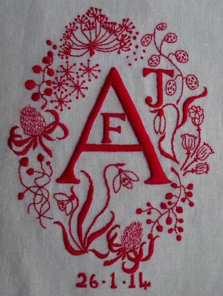
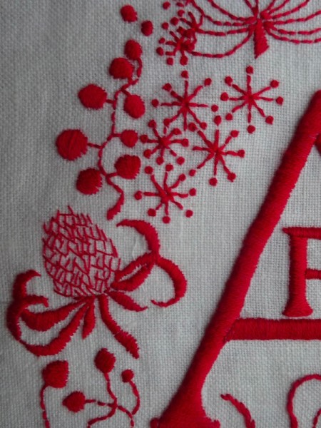
Some bright red stitching is such a good idea for January. Not only is red an uplifting colour, it’s also easier to use at a time of year when light quality is poor and evenings are long. (I’ve almost given up embroidering white on white in the evening as my daylight sewing light keeps me awake at night.) This monogram celebrates the birth of a little girl this time last year and I tend to chose a strong colour for things like this in the hope that the recipient will still quite like it when she’s a teenager.
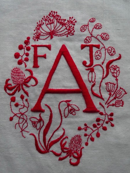
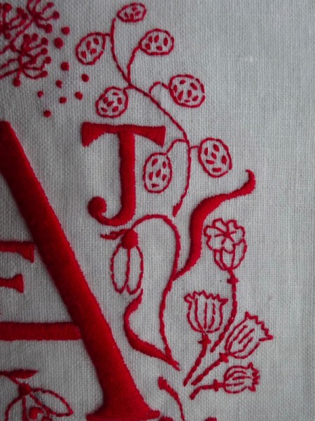
I sketched this design out quickly and sewing went well. I really enjoyed using the red and liked the comparative symmetry. Then I stopped and had a hard look at the letters (see 2nd photo above). What appeared fine in a sketch suddenly looked all wrong in bright red – suddenly FAJ leapt out at me which was a short step away from FAT and I thought this can’t sit on a child’s wall. I could just imagine some bright little friend coming to tea, bouncing into A’s bedroom and asking why it said FAT on her wall. Disaster.
I emailed daughters and got tactfully phrased replies. Meanwhile I was thinking that I might have to start again with a new piece of fabric because I know only too well from experience that quite often unpicking red thread leaves a definite red residue in the stitching holes which never really disappears. So… I put it to one side for a while and did something else – always a good solution.
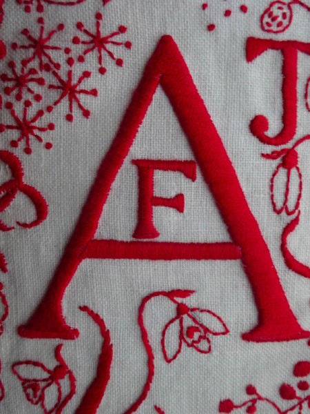
The next morning, more serene and resigned, I unpicked F, re-did it inside the top part of A and covered over F’s thread holes with seed heads. I’ve lost an element of symmetry but gained a different dynamic which thank goodness now no longer spells or hints at anything.
(Go into the gallery, this page top right, if you want to compare before and after images more easily.)
As the child was born in January, I’ve embroidered poppy heads, honesty, Japanese anemone seed heads, teasel heads, berries from an unknown shrub in the garden and snowdrops which I’ve definitely seen somewhere, though not in our garden.
12 Comments
I think that the revised version looks wonderful – the seed heads appeal to me very much. Really lovely. Bx
Very comforting to hear you say this. Thank you Becky.
I think you were wise to revise the placement of the letters! The colour is beautifully vibrant and the seed heads and snowdrops are perfect for a January birthday X
Glad you like it – I always think bright red is such a delight – like sewing with lipstick.
Wow, this stunning, a really dynamic successful design. Well done for unpicking, it has made such a wonderful difference. Really love the strong stylised flowers, so pretty.
It is interesting how different the whole thing looks with just the moving of one letter. Thank you for such a nice comment.
I like the result. It’s always worth rethinking a project like this, but it does need the time to distance oneself from the first version!
Yes, putting a piece of work away for a while is always a good idea before making a decision – even if it’s only over night. It’s good to know that you think the end result is ok.
This is my favourite monogram out of all the ones you’ve posted so far. The re-design to achieve balance is a stroke of genius, enhancing the completed imagery into something timeless yet contemporary.
How interesting that you like this one best.Thanks for your kind remarks.
It is one of my favourites too Mum. Thank you! I think Jules will love it (and baby when she is old enough!)
Very pleased you really like it.