Suzani is the name of the very distinctive embroidery produced in Uzbekistan, mainly the cities of Tashkent, Nurata, Samarkand, Bukhara and Shahrisabz, each place producing work with a local twist which helps those who know about these things to distinguish the place of origin of any given embroidery. The western fashion for vintage Sunzanis has made such an impact on demand that it has led to a revival of a craft which had almost disappeared under the communist government of the mid C20th.
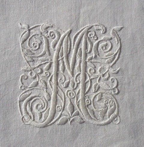
Fortunately after the fall of the Soviet Union in 1991 there remained a well of knowledge of the craft among older people and now these are passing their skills of both design and practice on to younger people – often members of the same family. Look here for an uplifting article describing the new industry in more detail – it is also where I saw the motif on which I based my own embroidery for the monogram shown here.
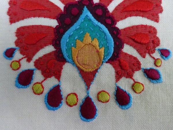
Floral motifs abound in Uzbek suzanis and favourites include palmettes (the one I have used), rosettes (most common) and pomegranates. You can also often see some borrowing of Ottoman motifs, like the tulip, as a direct result of historical cultural interaction and trade along the silk route.
I love the stylised flowers of the suzani but I make no attempt to reproduce them exactly, preferring to interpret the motifs in in appliqué as well as embroidery – but satin stitch rather than chain stitch or basma stitch (also known as Bukhara couching). It is interesting that the women who make suzanis (and those who made them in the past) never sought to produce identical work. The background fabric is hand woven on narrow looms (ideal for work in the home) and several women work on individual strips which are then sewn together to make one large bedcover or hanging. This leads to a certain irregularities in stitching, colour and tension such that the motifs don’t match up and align perfectly.
Some westerners appreciate such inconsistencies as part of the unique delight of hand made things but others, deeply immersed in the regularity of machine made textiles, complain and regard the work as shoddy and substandard. It surprises me how uplifting it is to read about this in the Hand and Eye article mentioned before as I often battle against expecting my own work to approach some ideal perfection which I don’t really want but somehow still seem to expect. I always like the idea of incorporating (or rather not eradicating) errors on the grounds that only God is perfect, although, by the by, it’s very difficult to find any authority for this idea which is often swatted away as unworthy of consideration as if it’s an irritating fly the world could well do without. (I bet QI have torn the idea apart and, klaxons blaring on all sides, have consigned it to the bin of urban myths we should immediately abandon. Apologies to those who do not know this British television programme.)
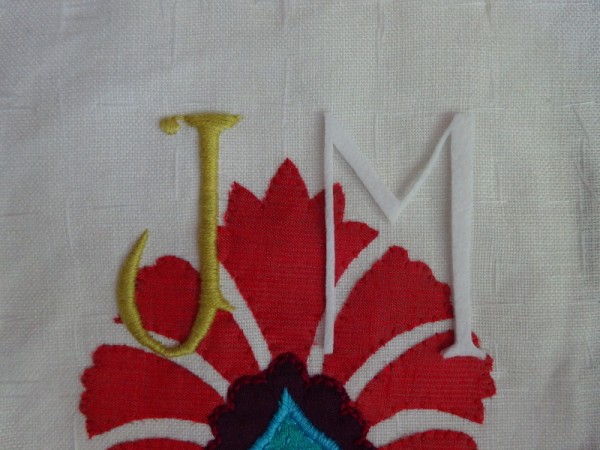
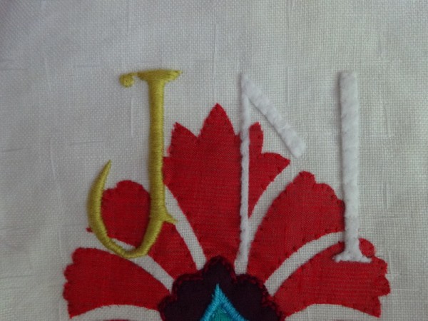
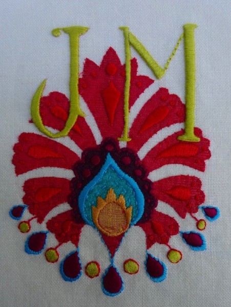
Discussion of perfection put aside, this monogram is a celebration of colour. Perhaps the letters would have stood out more in black but I just loved the lime green which reminds me of light through young beech leaves. I fought a worm of an idea to unpick them and do them again and decided to glory in their not being perfect. Battle won.
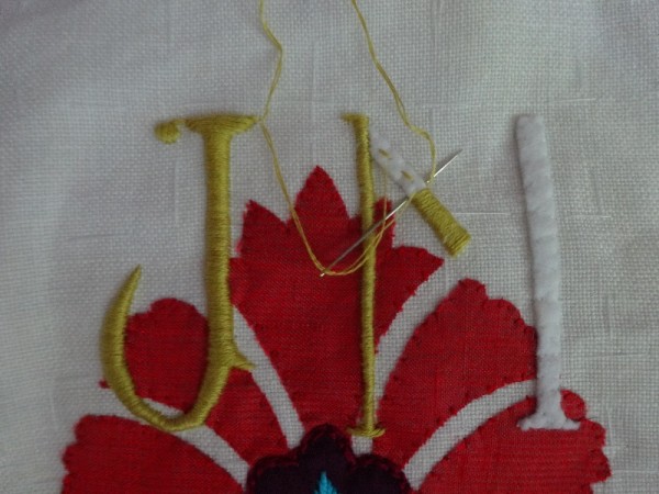
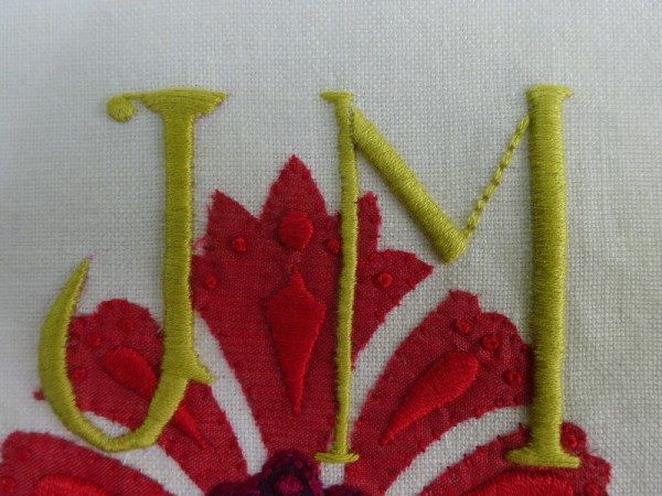
I have included some photographs showing the stages of making padded letters as Penny has asked me to in recent comments. I will try to go into more detail in future posts but hope in the meantime, theses images are helpful. (And a propos my non pursuit of perfection you can clearly see that the end down stroke of the ‘M’ is a bit curvy – something I didn’t even notice until I added these photos!)
For my own version of a suzani cushion look here where you can see it alongside the real thing (bought from Liberty).
18 May Update: It’s no good, I’m unhappy with the ‘M’ and realise I’m going to have to re-do it. Too spindly and pathetic, it distracts from what I like about this monogram. I shall not do it today as I’m having a bit of a tidy up anyway I feel I need to take it slowly. Hope to post a new photograph later in the week.

12 Comments
I love the bright, vibrant colours in this piece – glorious!
But in my experience there is no need for introduced errors – they arrive without my volition!
Yes, Rachel one doesn’t have to introduce errors – just live with those that appear anyway and this monogram is a case in point. After a night’s sleep I realise I can’t stand the ‘M’ and I’m going to have to re-do it. Hey ho.
A joyous blaze across the screen this morning – how lovely. I like the lime green letters too – parrot colours similar to those flitting past my window as I write. Fascinating also to see how you pad the letters to give them relief – trade secrets Mary. I am now going to peruse the article about Suzani….
Lydia, I like the parrot imagery and smile at the thought of them flitting by your window. There are no parrots here but in many of our parks – especially London ones – there are so many escaped pet parrots that whole colonies have formed and make the English landscape look and sound confusingly exotic – especially on miserable overcast summer days!
Thank you SO much, Mary. I always love behind-the-scenes tours of theatres or workshops for offering glimpses into the painstaking detail that goes into the finished craft, and this generous insight into your own artistry is fascinating. Your extremely well-researched commentaries, as well as personal asides, always make such enjoyable and pleasurable reading, acting as a springboard, most times, to further internet sources of more delights. I’m certain there is a book or two in you…
Penny, thank you for your lovely ego boosting comment. I’m glad you liked the step by step addition and I’m also pleased that my blog acts as a springboard into new realms – just as other people’s blogs and images have opened doors to me. Life without the stimulation of internet discoveries is almost unimaginable now and one must remember this when feeling depressed about the downsides of internet access, mustn’t one?
Ironically, having carefully charted the progress of ‘M’, I’ve now realised that I’m very dissatisfied with it and must re-do it – spindly, bandy legged object it’s turned out to be! I hope to have a new image by the end of the week.
You must come to one of my workshops, Mary, where I teach The Art of Imperfectionism. It’s a difficult one but, as a dedicated imperfectionist, I do my best.
It’s a fine line between acceptable imperfection and the unacceptable sort. The ‘M’ falls firmly into the second camp and will have to be re-done. It shrieks for attention every time I see it and stops me enjoying the other things I like about the embroidery. Having set it aside for a couple of days, I still feel the same about it. I can’t imagine where to begin to teach The Art of Imperfectionism – but it sound like it would make a great book!
The colours here are so vibrant Mary, the green is reminiscent of spring growth and that eager blossoming of everything at this time of year. So interesting to see your step by step photographs too, do you cut your felt letters with a scalpel? They are so dainty and incredibly neat. I think you are so much more talented than you begin to realise, and I am sure any book written by you would fly off the shelves, particularly when you give such in depth information about the cultural and historical meaning behind many of your embroideries. A book by Mary Addison, what a marvellous prospect! x
How wonderful it is to receive such generous comments. Thank you, Penny. Blogging and getting feedback stimulates ideas and encourages getting on with projects. Your comments are very important to me.
As to scissors, I use whatever perfectly ordinary scissors come to hand and have 2-3 pairs that seem ok. One of my pairs of scissors are from Vietnam and I’m very pleased with them. When/if they cease to perform well, I shall check with Lydia (in Australia) who often comments here as to how good the scissors are that she sent for from a Sheffield company – the choice was impressive and it was good to know Sheffield is still producing such things.
I wasvery interested in this as my mother (1913-1994) was born in Tashkent. As a small child, I was allowed to dress up in some clothes she had had in Russia when she was very young. They were made of beautifully smooth cotton embroidered in black and red. I still have a small piece of the embroidery.
Fascinating. How lovely. If that piece of embroidery were mine, I think I couldn’t resist framing it – perhaps embroidering her initials on it (if there is any plain fabric with no embroidery) as a visual reminder of an exotic beginning.
One Trackback
[…] is much, much better than this. ‘M’ now has a lot more substance to it. The M has been re-shaped and the former design […]