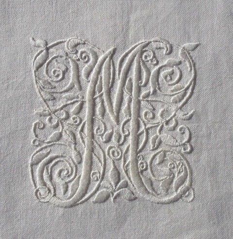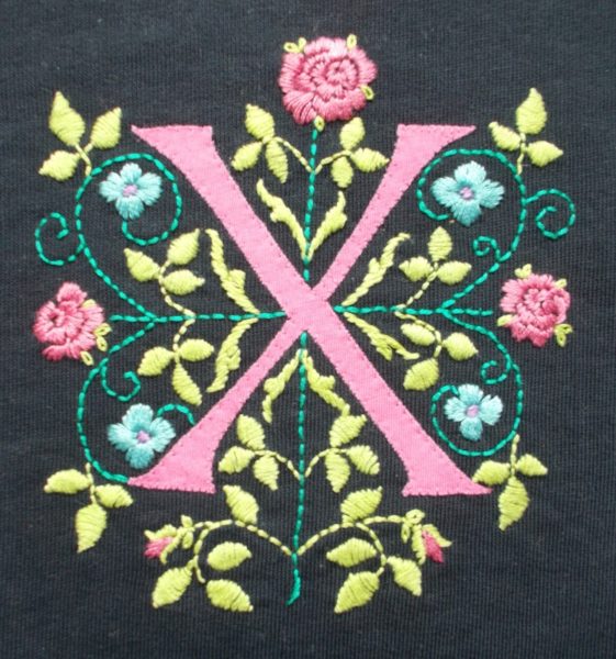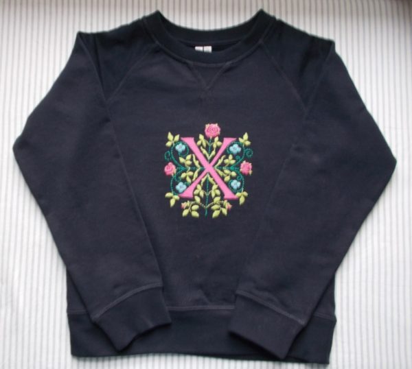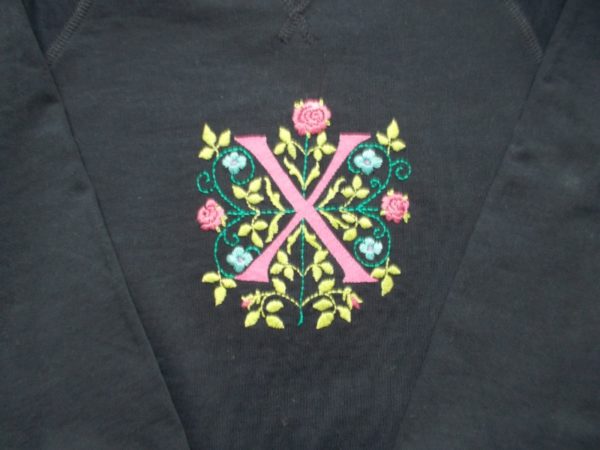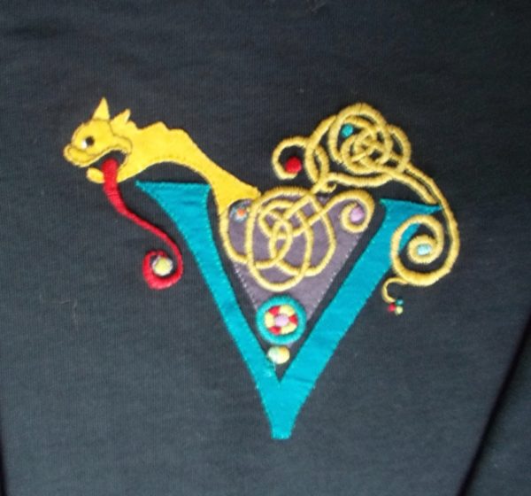
V monogram on sweatshirt loosely based on lettering from The Book of Kells (hand embroidered by Mary Addison)
A much indulged tendency towards curlicues in my embroidery means it’s easy to be drawn towards the complex interlacings found on every page of The Book of Kells, that singular manuscript of the 4 Gospels dating from about 800 AD which is attributed to the Iona Scriptoium, whether at Iona in Scotland or Kells in Ireland, or both, after Viking raids forced the monks’ relocation. Of course the big full page illustrations are undeniably stunning in design, virtuosity and detail but it’s the small illustrations in the text and the large initial letters that really take my fancy.
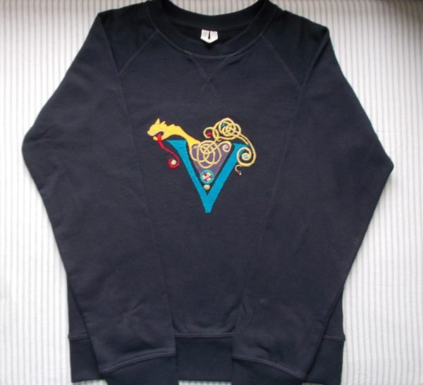
Sweatshirt with V monogram (hand embroidered by Mary Addison)
Four major scribes can be identified which my Thames and Husdon Official Guide to the Book of Kells says somewhat coyly operated at different levels of expertise, although all had the same training. Each also combined script and ornament in their own individual way which seems not to be dependent on a house style. This is the wonderful thing about manuscripts, their production is so labour intensive that little idiosyncrasies of the man behind the writing can’t help but seep through and declare his personality. Scribe A is described as sober and conservative and his style is very like that of the C8th Durham Gospels. He didn’t usually decorate his own work but left spaces for another scribe to add initial letters and their decoration. Sometimes he forgot to leave a space and the ornamented capital letters then had to be added in the margin. Scribe B had something of the overseer about him (possibly self appointed) for he seems to have gone over parts of the MS completing the text and adding decoration and even making additions to pages that the original scribe would have considered complete. My guidebook is clear, “he comes across as a supremely talented but restless personality, who was active when the scribes who had gone before him were not in any position to offer guidance or restraint.” Sometimes, he changes ink up to 3 times on the page – perhaps he was bored. On another page where the text has been repeated, he has added little fancy Latin crosses in his characteristic red ink in and around the text as a sort of sanctified cancelling. Scribe’s C script is described as ‘steady and practised’ with a particular skill in including animal and human forms in nearby initials. Scribe D goes in for darker ink and he likes to elongate letters or the ends of words at the end of verses or where space permits; sometimes he too includes parts of nearby letters in his images. (Whether the scribes also produced the manuscripts large painted pages or whether these are the work of others is not known for sure.)
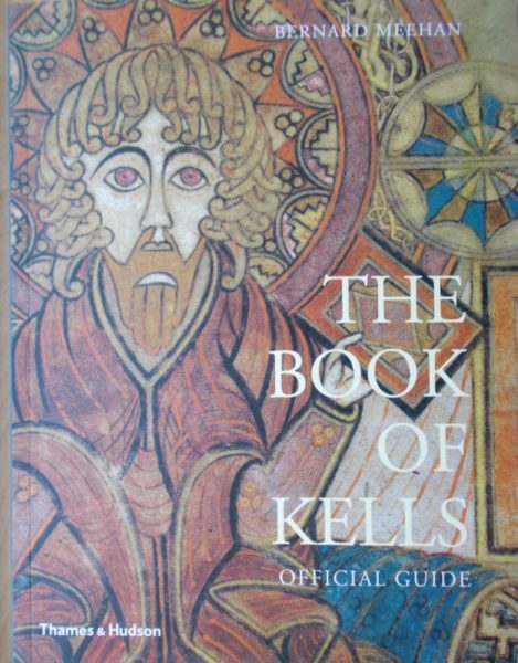
Official Guide to the Book of Kells by Bernard Meehan (T & H 2019)
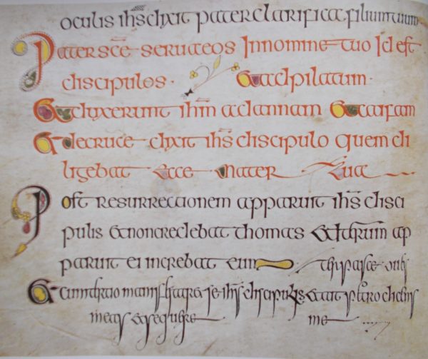
The Book of Kells:the first page of John’s Breves Causae in the hand of Scribe B
There are few capital letter Vs in the text and anyway in classical latin there’s no distinction between V and U (on inscriptions Venus would appear VENVS), so I took elements of design from here and there.
Above is a favourite page from the MS in Scribe B’s hand. I particularly enjoy the decorated Ps and flowing decoration within the text.
Below are four examples of the word ‘et’ found at the beginning of lines of text. The scribes seem to enjoy decorating this tiny word so that it’s different every time it appears and each is a small masterpiece in invention and design. Sadly, I have no information as to which scribe did any of these.
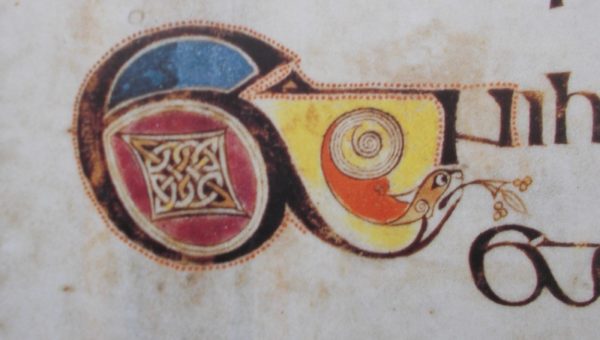
A decorated ‘Et’ from The Book of Kells
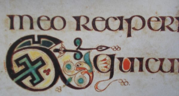
A second decorated ‘Et’ from The Book of Kells
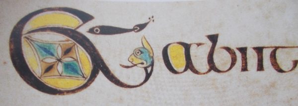
Third decorated ‘Et’ from The Book of Kells
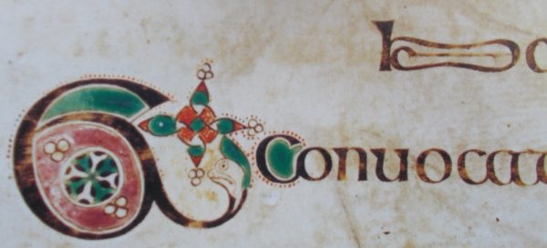
Fourth decorated ‘Et’ from The Book of Kells
