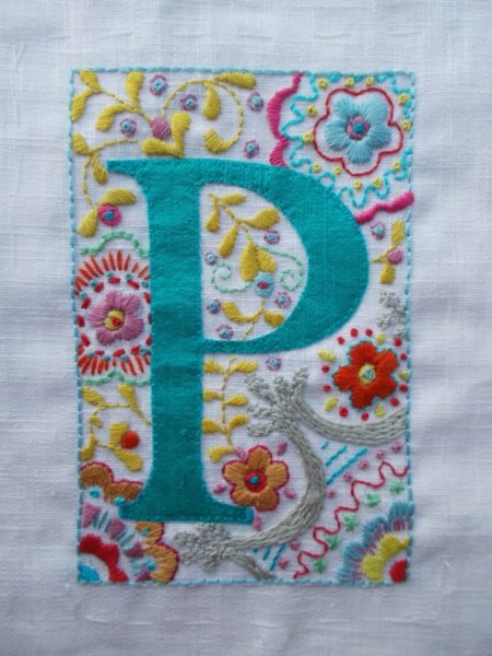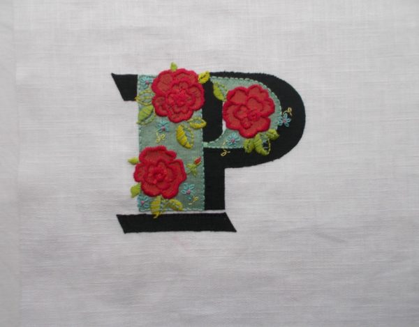
Embroidered P based on a letter in one of Louis Pouchée’s typeface alphabets (hand embroidered by Mary Addison
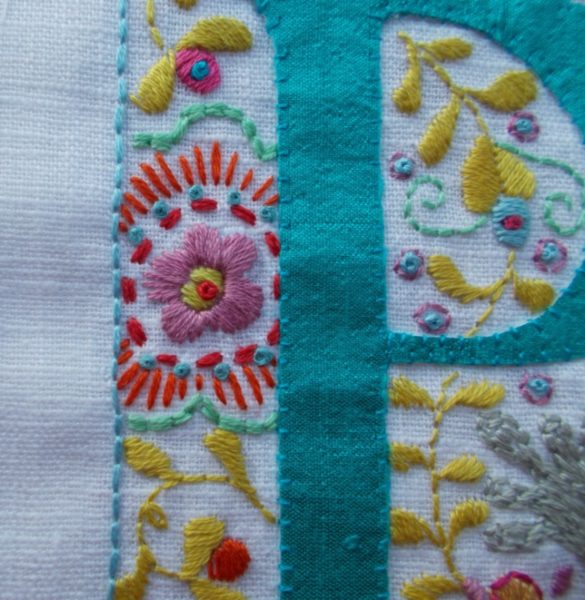
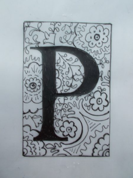
For a long time I’ve had my eye on embroidering an initial based on one of Louis Pouchée’s wonderfully fancy letters and, at Christmas, desperate for a present for daughter No 2 who lives abroad, has most of her things in store and is thus the last person to need yet more stuff, I thought the time was right to make her something small and packable (to be framed in an Ikea box frame with perspex ‘glass’). I had in mind white on white, or possibly, rather more graphically, like the original, black on white. But, having been presented with the initial in sketch form, daughter No 2 was adamant about wanting it in colour. I think she may have had rather brighter colours in mind than I’ve managed and that the black may be just a bit too, well, black for her, but there we are. (I’m now inclined to do one with an off white silk background and grey shaded sections, so that similar colour flowers and leaves have more of an impact. Then she can have the pair. Oh how tasks multiply!)
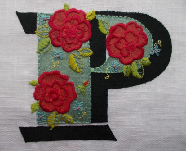
Embroidered P based on a letter in one of Louis Pouchée’s typeface alphabets (hand embroidered by Mary Addison
Looking at Pouchée’s stunning typefaces (and there are 23 ornate alphabets that we know about with a further 8 lost), you’d think the man that could produce them would be an artist born and bred, so it came as a bit of surprise to discover he was probably an entrepreneur who’d tried his hand at various things before settling down to producing typefaces. Briefly, from 1811-12 he was the owner of the Alamode Beef and Veal House in Holborn. He was also co-owner of a coal merchants nearby, set up in the same year as the chop house though his association with this lasted longer, until 1822. By 1818, however, the itch to branch out seems to have reasserted itself and this time he set up a type foundry in Lincoln’s Inn Fields, importing sophisticated machines, developed by the engraver Henri Didot in France. (Didot was so skilled an engraver that he produced a microscopic type called Non Plus Ultra (no more beyond), though he was probably best remembered for printing assignats, the paper money in use, 1789-96, during the French Revolution.) Pouchée’s typefoundry was run along lines of his own choosing which led to unrest in the industry and unpopularity amongst fellow foundry owners. His business closed in 1830, possibly threatened by financial collapse and the assests were sold off.
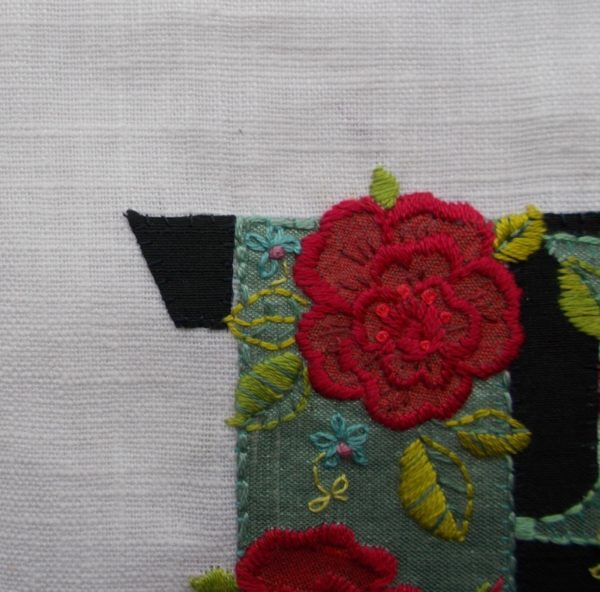
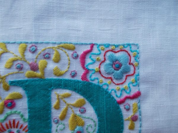
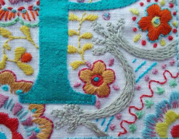
Detail: Embroidered P based on a letter in one of Louis Pouchée’s typeface alphabets (hand embroidered by Mary Addison
In 1966, James Mosely, Librarian at St Bride Library identified material in the collection as Pouchée’s work, verification coming later with the discovery of one of Pouchée’s type catalogues. Recently a small run of 200 sets of the 23 alphabets was produced, hand printed from the original wooden blocks. How beautiful – and expensive – these must be!
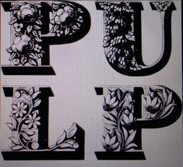
Louis Pouchée’s letters used on Pulp’s album cove We love Life (2001)
Originally produced as eye catching elements for printed ephemera, they are still much used, and copied today on book covers, record sleeves (Pulp’s Album ‘We Love Life’ of 2001), in advertising and for promotional campaigns. The body of these sturdy, plump figures, with flat faces and slab serifs lend themselves well to rich figurative decoration – all the more remarkable when you think the originals would have been carved out of single blocks of end grain boxwood. Glorious! To learn more about Pouchée and his typefaces do read this.
